
MYdata (UI redesign)
User Interface improvements to an existing personal data collection app.
Contributions:
Orignal project by Dr. Sarah Schoemann and Jo Jackley. UI redesign developed with Drew Smuniewski, Arden Greene, and Lucas Fancher.
- Analysis of existing UI
- UI/UX design
- Prototyping
- User Testing
- Troubleshooting
Development:
- Android Studio
- React
- Node.js
- Scrum & Agile Methodologies
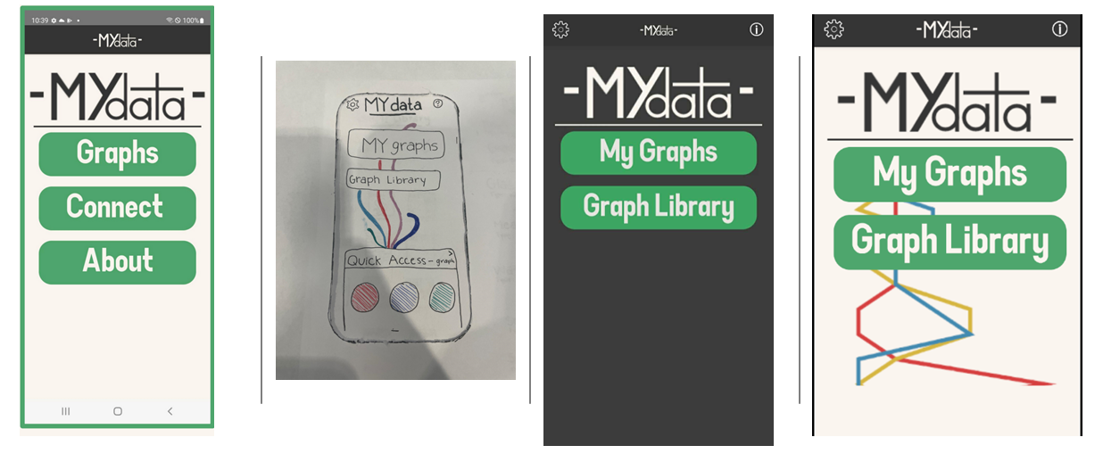
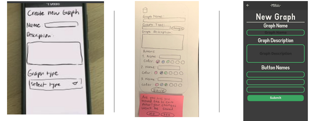
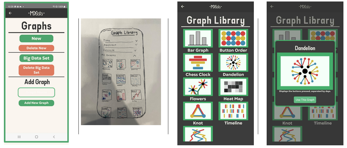
This project was undertaken as part of my capstone class in college. We worked with a professor (as a "client") to begin redesigning the user interface of an app she and another student had been working on. We worked within the Scrum & Agile methodologies, each team member serving a rotation as Scrum Master.
We analyzed the existing interface and ran tests to see where improvements could be made. We identified several potential confusion points for users, and created a new workflow for the app. From there, we prototyped potential solutions, tested them, and implemented the improved interface into the app.
This project ran into significant technical roadblocks. At the beginning of the project, none of the team members had any experience working in Android Studio, setting up a virtual machine, or working with React or Node.js. Additionally, the project did not have much developer documention. While the UI redesign itself went smoothly, there were significant delays in implementing the UI changes. However, we were able to accomplish a good portion of what we set out to do before the deadline, as well as create some documentation for future developers working on the project.
View prototypes, the workflow, and draft documentation on the project here